How to Combine Scrap Fabric Colors That Never Matched
Mixed scraps look planned when light, medium and dark are in the right places. A guide to value, neutrals, print scale and limited palettes.
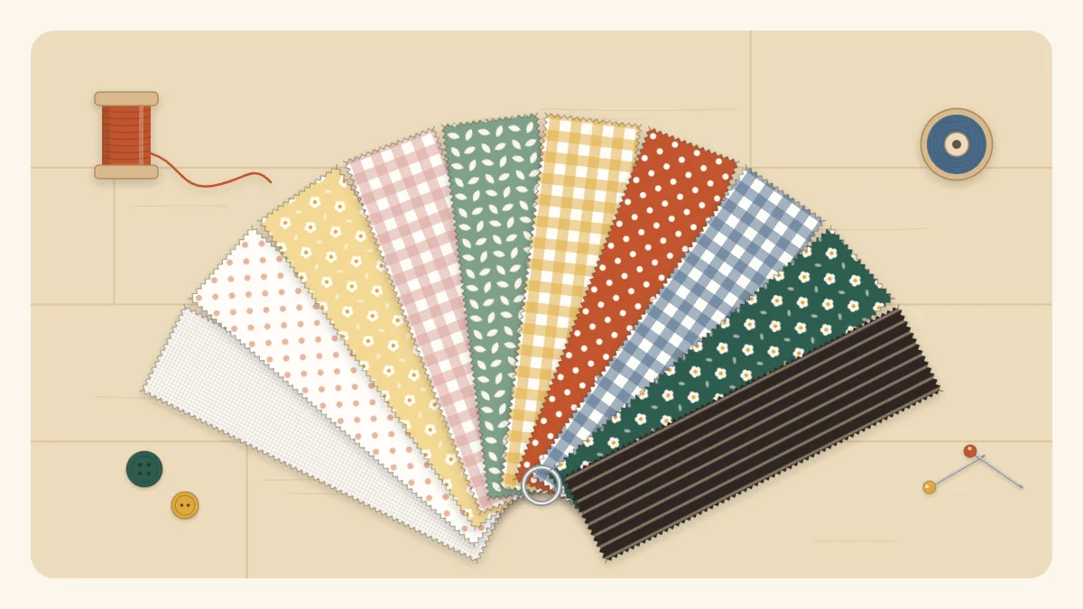
Combining scrap fabric colors is the part of scrap sewing that worries people most, and it is easier than it looks. A scrap bin is a collection of fabrics that were never chosen to go together, so the usual advice about matching does not help much. What does help is a short list of things to check: how light or dark each piece is, whether there is something calm to rest the eye, and whether the prints differ in size.
None of this requires color theory. It requires laying fabrics next to each other and looking.
Value matters more than color
Value is how light or dark a fabric is, regardless of its color. A pale yellow and a pale blue have the same value. A navy and a deep burgundy have the same value. In patchwork, it is the difference in value between neighboring pieces that makes a pattern show up. Color gets the credit, but value does the work.
This is good news for scrap projects, because it means almost any colors can share a block as long as the lights, mediums and darks are in the right places.
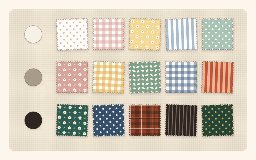
Sorting scraps into light, medium and dark
- Pull out a handful of scraps for the project and lay them on a plain surface.
- Pick the lightest and the darkest and put them at opposite ends.
- Place every other scrap between them by comparing it with its neighbors, not by naming its color.
- Split the line into three groups: light, medium and dark.
Most scrap bins turn out to be heavy on mediums. That is normal, and it is the usual reason a scrappy project looks muddy. If the medium group is much the largest, add a few true lights and true darks before you start sewing.
Tip
Value is relative. A medium blue acts as the dark next to cream and as the light next to navy. Judge each fabric against the ones it will actually touch.
The squint test
Squinting blurs color and print and leaves mostly light and dark. Lay out the pieces as they will be sewn, step back a few feet, and narrow your eyes until the details soften.
- If the pattern is still visible, the contrast is strong enough.
- If two neighboring pieces melt into one shape, they are too close in value. Swap one out.
- If one piece jumps forward and nothing else does, it is much lighter or darker than the rest. Either repeat it elsewhere so it looks intended, or replace it.
A phone camera does the same job. Take a picture of the layout and switch it to a black-and-white filter. Pieces that looked completely different in color often turn out to be the same shade of gray.
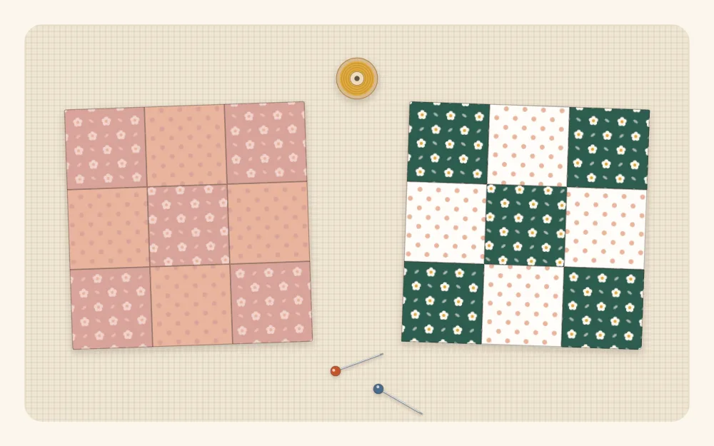
Low contrast is not wrong. A soft, blended look suits some projects. It only becomes a problem when you wanted the pattern to show and it does not.
Add a neutral to tie things together
A neutral is a fabric that does not compete: white, cream, oatmeal, gray, tan, or a quiet print that reads as one of those from a distance. Repeating one neutral through a project gives all the busy scraps something in common.
There are a few simple ways to use one:
- As every other piece. Alternate scrap squares with neutral squares, as in a checkerboard.
- As the background. Use scraps for the pattern pieces and the neutral for everything around them.
- As a frame. Sew a narrow neutral border around a scrappy panel, or use it for the back and binding.
The neutral does not have to be light. Charcoal or navy makes bright scraps glow, and a mid-gray calms a loud mix. The only real requirement is that it is clearly lighter or darker than most of the scraps beside it.
Mix the scale of prints
Scale is the size of the pattern on the fabric. Three prints of the same scale next to each other tend to blur together, even when their colors differ. Mixing scales keeps each one distinct.
| Scale | Examples | Role in a scrap project |
|---|---|---|
| Small | Tiny dots, pin stripes, mini florals, small gingham | Read almost as solids; easy to use anywhere |
| Medium | Larger dots, wider stripes, florals about a thumbnail across | Carry most of the interest |
| Large | Big florals, bold geometrics | Change character when cut small; use sparingly |
| Solid or near-solid | Plain cotton, tone-on-tone prints | Give the eye a place to rest |
Large prints deserve a second look when cut into small pieces. A 2 1/2-inch (6.5 cm) square from a big floral might show only a patch of leaf, and that patch may be a completely different color and value from the fabric as a whole. Judge the cut piece, not the yardage it came from.
Limited palettes for scrappy projects
A scrappy project does not have to use every color in the bin. Setting a limit before you pull fabrics is the quickest way to make mixed scraps look planned.
- One color plus a neutral. Every blue scrap you own, with cream. Many prints, one color family, always works.
- Two neighbors. Colors that sit side by side, such as blues and greens, or rusts and mustards. Calm and easy.
- Warm against cool. Mostly cool colors with a small amount of one warm, or the reverse. The minority color becomes the accent.
- Anything goes, with a fixed neutral. Every color allowed, held together by the same background throughout.
- Take it from a print. Pick one multicolored scrap you like and pull only the colors found in it.
Sorting the bin by color first makes these palettes much easier to pull. If yours is still one big heap, the guide on how to sort fabric scraps is the place to begin.
Watch out
Check for color bleeding before mixing strong reds or dark blues with pale fabrics in anything that will be washed. Wet a corner of the dark scrap and press it against a white piece. If color transfers, wash that scrap separately first or leave it out.
Practice on small blocks
The fastest way to build an eye for color is to make small things and look at the result. A four-patch or nine-patch takes minutes and shows clearly what contrast does; the guide to patchwork for beginners covers both. For techniques that welcome a truly random mix, try a string quilt block or crumb quilting, where the more varied the scraps, the better the block tends to look.
When a combination looks wrong and you cannot say why, go back to value. Often two neighboring pieces are simply too alike in lightness, and swapping one for something lighter or darker fixes it.
Frequently asked questions
What does value mean in fabric?
Value is how light or dark a fabric is, apart from its color. A pale pink and a pale green share a light value, while navy and burgundy share a dark one. Contrast in value between neighboring pieces is what makes a patchwork pattern visible.
How do I do the squint test?
Lay the fabrics out as they will be sewn, step back a few feet and narrow your eyes until the prints blur. If neighboring pieces merge into one shape, they are too close in value. A black-and-white phone photo shows the same thing.
Can I use every color in one scrap project?
Yes. A mix of every color usually works when one neutral fabric is repeated throughout as a background or alternate piece, and when there is a spread of light, medium and dark.
Why does my scrappy project look muddy?
The most common cause is too many medium-value fabrics and not enough true lights and darks. Adding a few very light and very dark pieces, or a clear neutral, usually sharpens it.